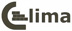
 The current logo reads “lima” to me. Could you consider making the “co” portion to be more recognizable as alphabets?